Why Most Landing Pages Fail (And How Yours Can Succeed) 🚨
Turn Clicks Into Conversions: How to Fix Common Landing Page Mistakes and Boost Your ROI
Imagine this: you've just launched a new ad campaign, excitedly watching the clicks start rolling in. You feel a sense of accomplishment. 💸 But there's a problem. Despite the increased traffic, conversions remain stagnant. You wonder why.
The reality is simple—your landing page is letting you down.
The Costly Mistake You Could Be Making
Many business owners fall into the same trap: pouring money into ads, thinking that the traffic will magically convert. But if your landing page doesn’t pull its weight, you’re losing money with every click.
A landing page is more than just a stopping point; it’s your chance to make a great first impression. Imagine showing up to a job interview and rambling about unrelated topics. You wouldn't get the job, right? The same logic applies to your landing page—it must keep the conversation going, guiding potential customers towards a clear decision.
Why Most Landing Pages Miss the Mark
So, what goes wrong? Picture this: Jane clicks on an ad promising a special offer. She’s intrigued, ready to take the next step. But once she arrives at the landing page, confusion sets in. The messaging doesn’t match the ad, there’s too much clutter, and the next step is unclear. Frustrated, Jane leaves.
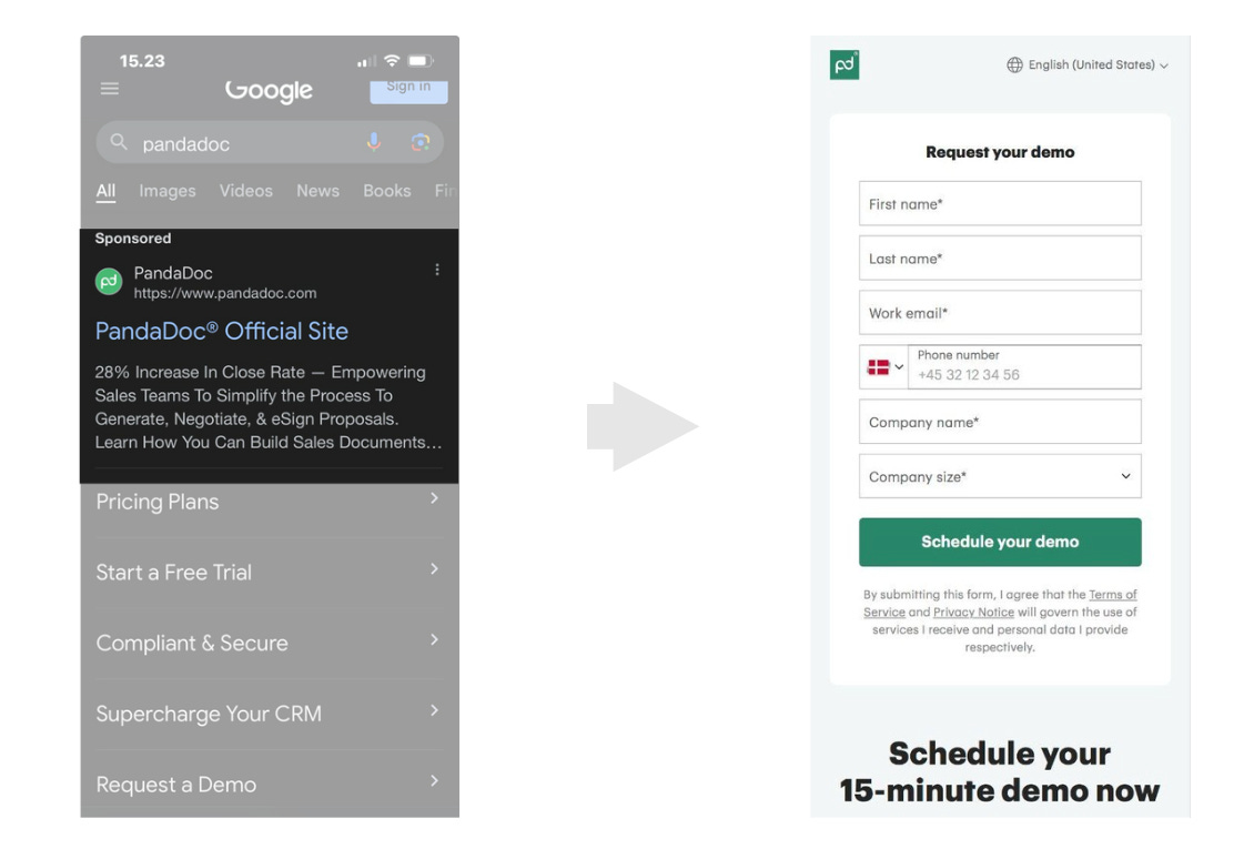
You see, businesses often fail to convert because of three main reasons:
1. Irrelevant Content
Imagine you’re eager to buy a specific product, but when you click the ad, the page you land on is all over the place. There’s no sign of the promised offer, and you start to lose trust. You quickly exit. Sound familiar? That’s what happens when a landing page doesn't deliver what the ad promised.
2. Lack of Clarity
A cluttered page feels like trying to solve a puzzle without knowing what the picture is. The more confusing the messaging, the faster people leave. You need clarity—no one wants to spend time figuring out what the offer is or how to act on it.
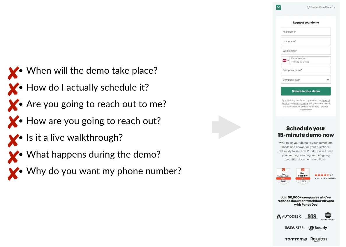
3. Too Many Steps
Think of it like this: you’re hungry and find a food truck. But before you can get your meal, you’re asked to fill out a form, verify your ID, and sign up for a loyalty program. Would you bother? No, and your potential customers won’t either. Landing pages that demand too much information or have unnecessary steps lose conversions. People crave simplicity, and the easier the process, the better your results.
How You Can Create a Landing Page That Converts
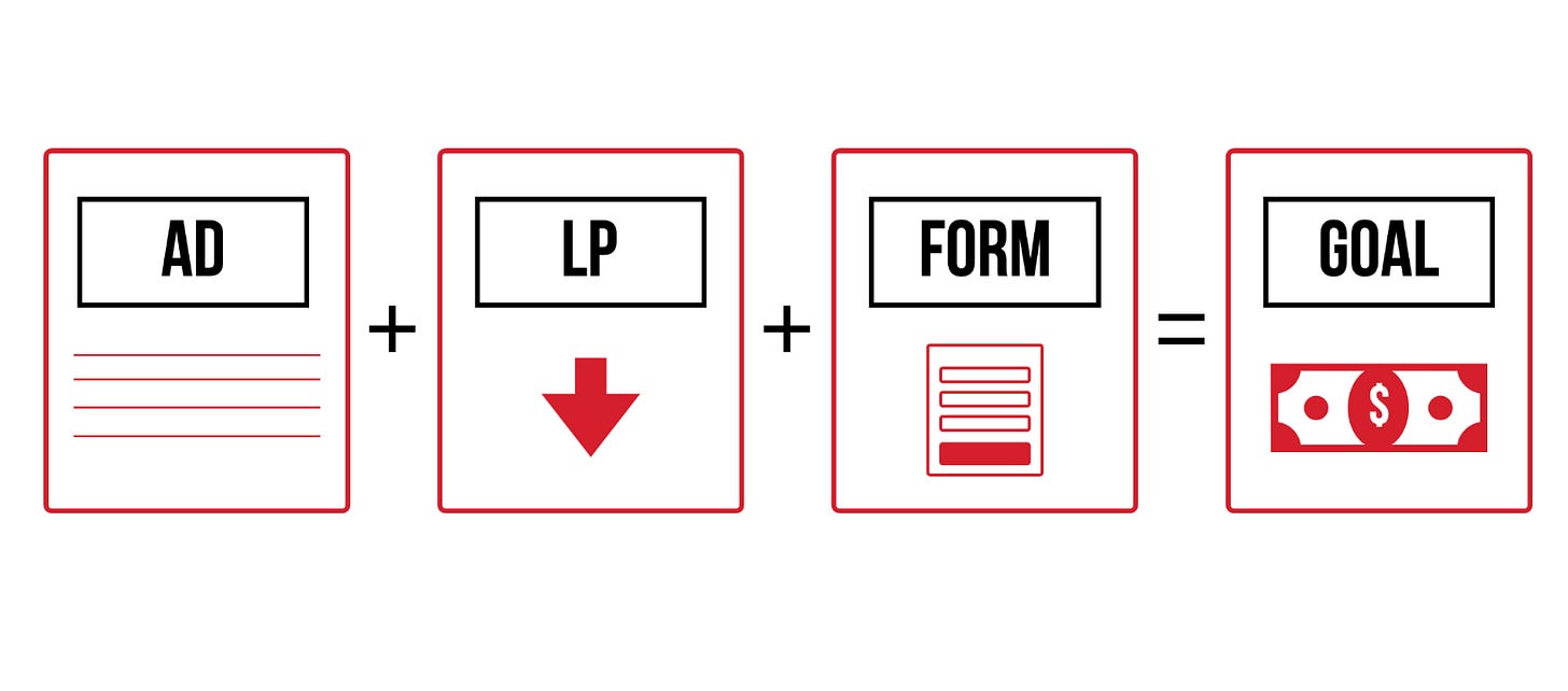
So, how do you turn things around? It’s not about luck—it’s about strategy. Follow these three steps to build a landing page that works:
1. Speak Their Language
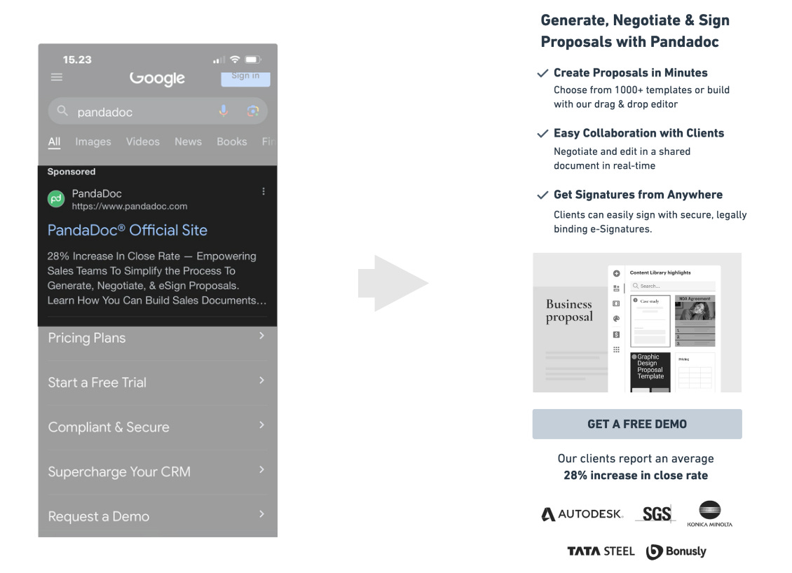
When someone arrives at your landing page, they have a specific mindset. Your job is to meet them where they are. If this is their first interaction with your brand, focus on providing helpful information. If they already know you, guide them to the next step in the decision process. Always craft your messaging to engage, not overwhelm.
2. Keep the Promise
Consistency is crucial. If your ad promises a free trial, your landing page should offer exactly that. The goal is to deliver a seamless experience from the ad to the landing page, maintaining trust along the way. Your message should be clear, direct, and to the point—no surprises or irrelevant content.
3. Make It Easy
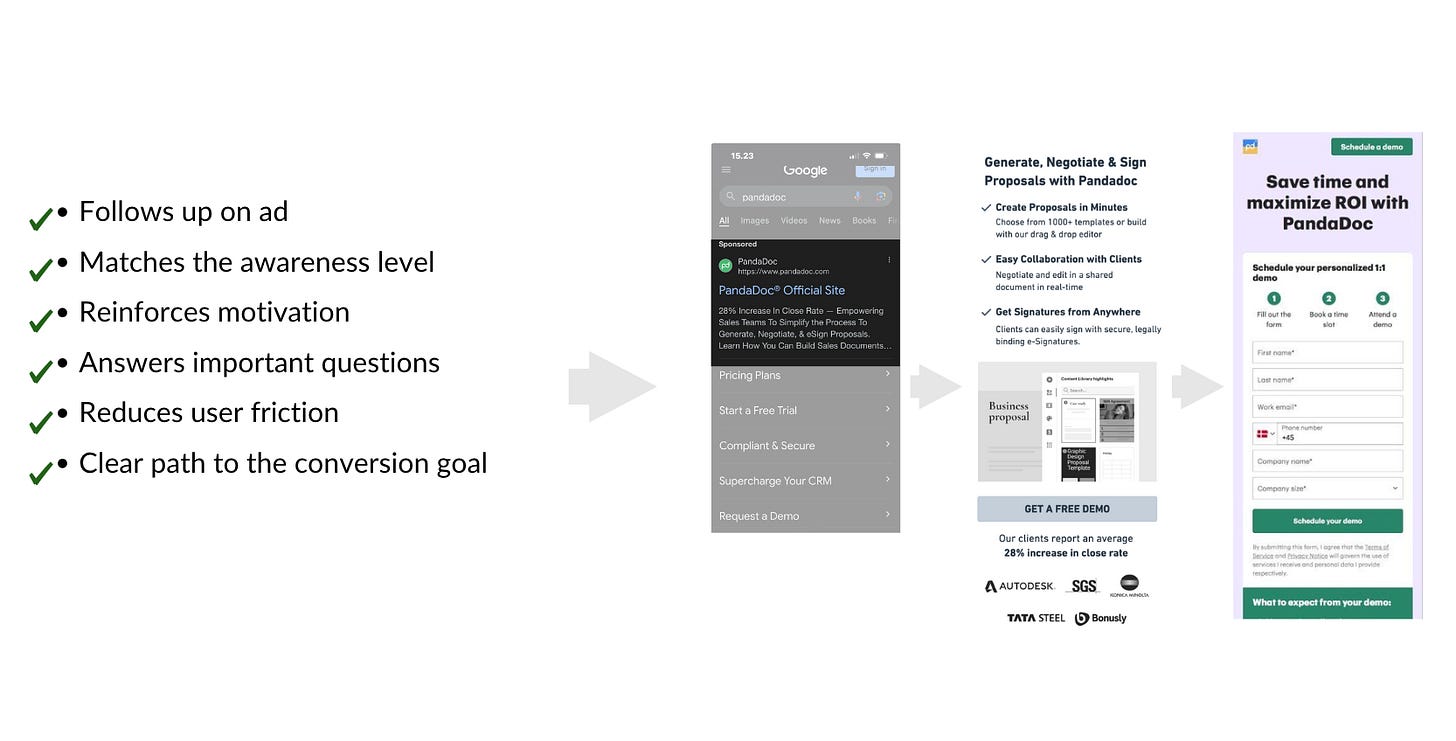
Think of your landing page as a helpful guide, not an obstacle course. Keep the steps simple: one clear call-to-action (CTA), a concise form, and answers to common questions. Make the page feel intuitive, not complex. Remove unnecessary fields and distractions to create a smooth path to conversion.
Anatomy of a High-Converting Landing Page
Imagine your ideal landing page. What do you see?
Clear Headline: It grabs attention, clearly communicating the page’s purpose.
Engaging Copy: It’s conversational, relatable, and speaks directly to the visitor's pain points. You use benefit-focused language that resonates.
Compelling Visuals: These aren’t just pretty pictures; they support your message, keeping users engaged and breaking up the text.
Strong CTA: Your call-to-action stands out, using clear language like “Get Started,” “Claim Your Offer,” or “Sign Up Now.” Visitors know exactly what to do next.
Social Proof: You show that your offer works. Customer testimonials, case studies, and trust badges build credibility and reduce hesitation.
How to Know if Your Landing Page is Working
Ask yourself this: Is my landing page helping solve a problem? If yes, you're on the right track. But to be sure, you need to check a few metrics:
Bounce Rate: A high bounce rate means visitors are leaving without taking action. This signals that the content or messaging might be off-target.
Conversion Rate: This is your real indicator. How many visitors are completing the desired action? If the numbers are low, it’s time to test different elements—headlines, copy, visuals, and CTAs—to see what works best.
Conclusion
Your landing page can make or break your marketing efforts. When done right, it not only converts but also maximizes your return on investment. By speaking your audience’s language, keeping promises, and creating an easy-to-follow path, you can transform clicks into conversions and make sure your landing page works for you—not against you.


